Project Details
Overview
| Client | Ngā Tahu Tourism |
| Sector | Tourisim |
| Discipline |
Wayfinding Strategy Sign System Design |
| Design Collaborators | ThoughtFull Design |
| Status | Complete 2018 |
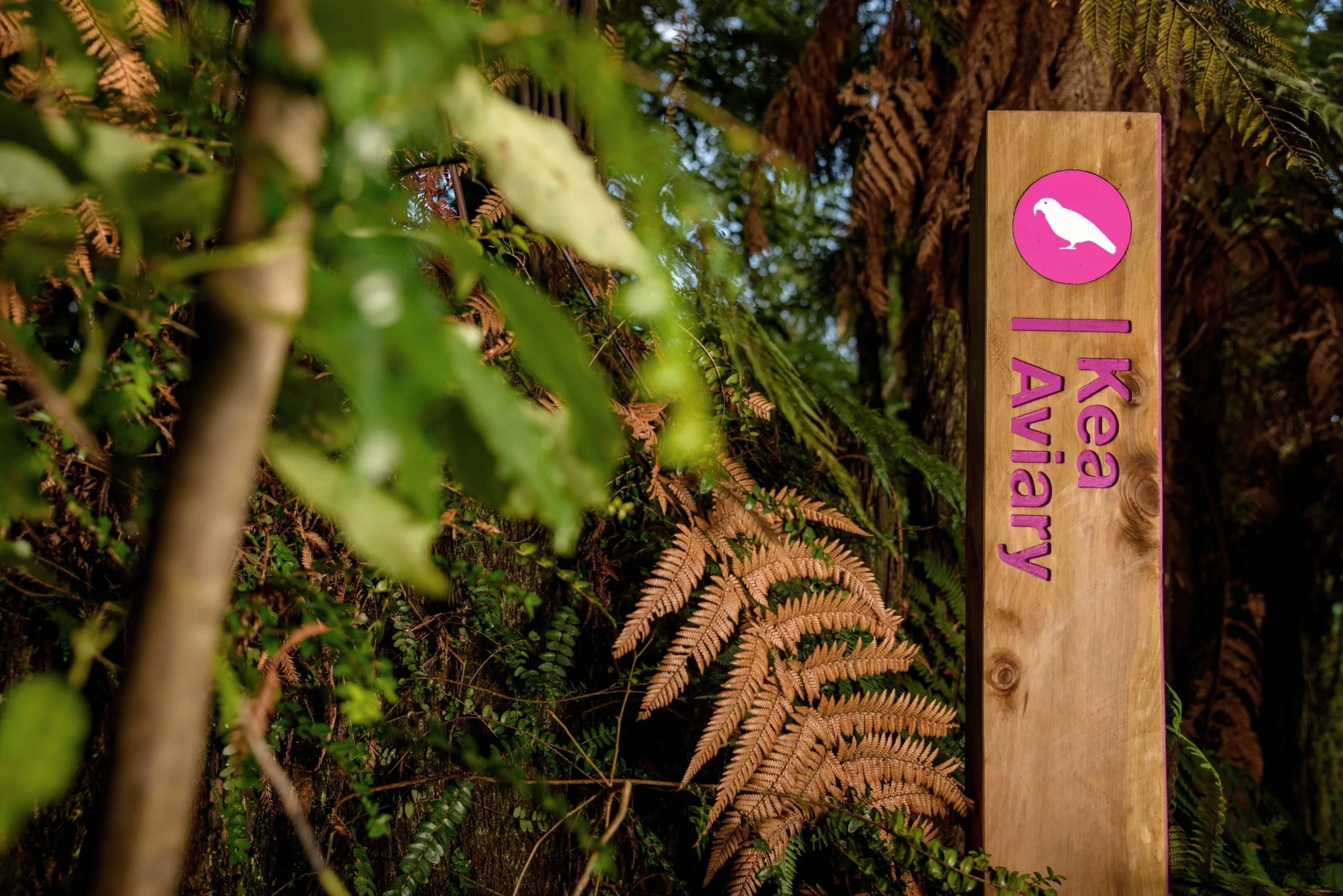
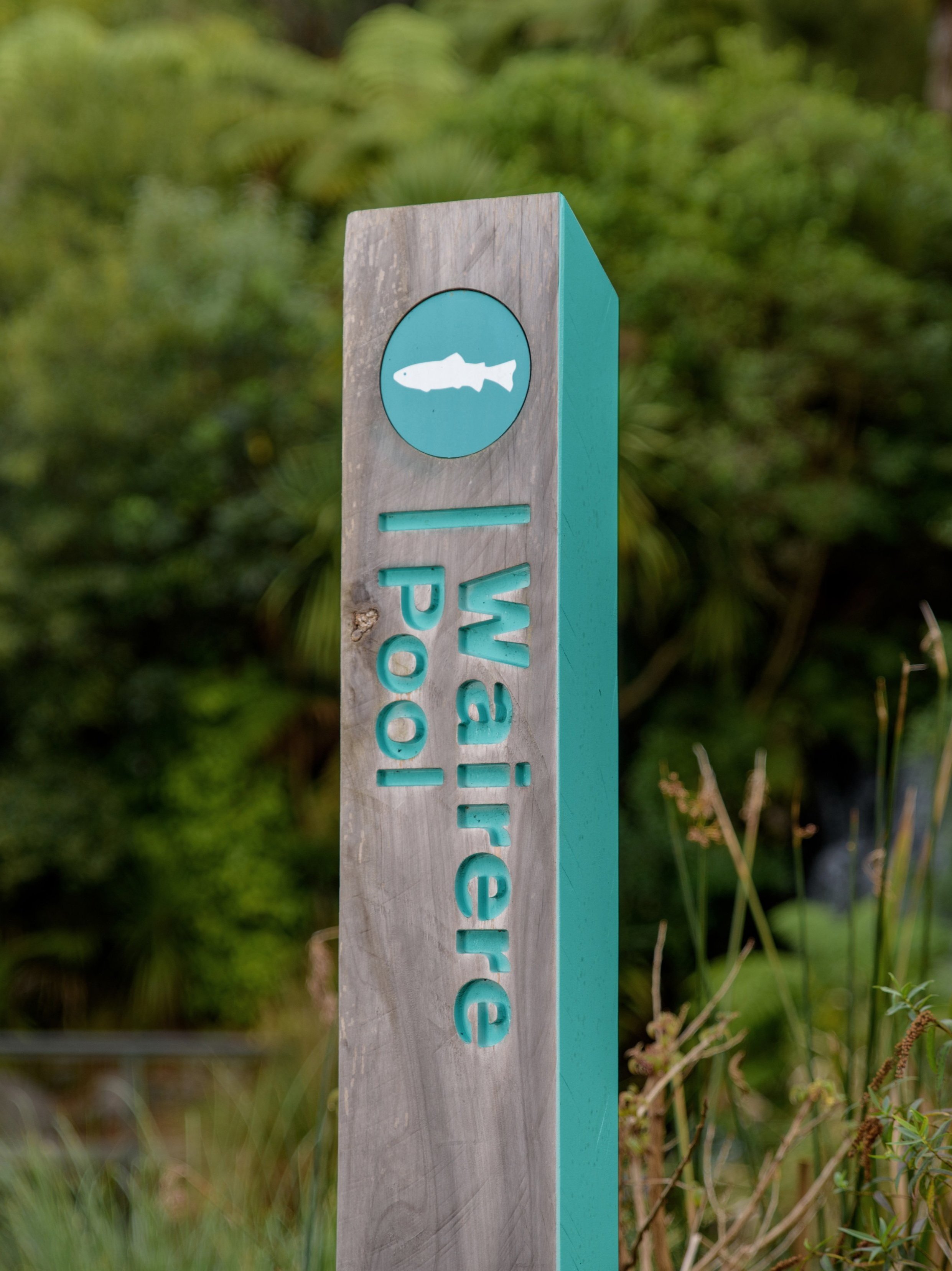
Drawing inspiration from the practical charm of DOC and national park signage, the signage design for the park is a collection of wayfinding totem poles that exude an intentional simplicity.
Harnessing the vibrant hues of a new ‘rainbow’ palette, each attraction within the park is distinguished by its unique colour. These clusters of bright tones serve as guiding beacons amidst the dense, native foliage.
Crafted from raw, locally sourced macrocarpa sleepers, the totems echo the sustainability ethos of national park signage. These posts were meticulously produced using router paint-filled techniques for durability and ease of maintenance.
With careful location planning based on defined journey mapping, the rollout of the new wayfinding system was executed swiftly. Ground staff played a pivotal role, embodying the brand’s ethos of ‘hands-on involvement,’ ensuring a seamless implementation process.
Site-wide Navigation
Rainbow Springs
Nature Park